Back
Back
Green Volunteers — Reforestation NGO, Treelings
One page, two audiences — volunteers and sponsors, each with a complete argument. Cyrillic typography, specced for the dev team to build.
Role
Design & Copy
Industry
Environment · Nonprofit
status
Live
Year
2025

Challenge
Green Volunteers takes young people out of Ulaanbaatar for planting days, teaches ecological practice alongside the work, and puts 1,000 trees in the ground each event. Four seasons in, 1,000+ volunteers have been through it, co-organised with the Mongolian Forest Research Association.
The page had to do two incompatible jobs. A prospective volunteer wants to know what the day is actually like — where to meet, what they'll do, whether they'll be out of their depth. A sponsor wants the case for funding — the scale of the problem, what a programme costs, what they get back. Most NGO pages pick one and lose the other, or blend both into something that persuades neither.
Two more constraints. The whole thing is in Mongolian, so the typography had to be built around Cyrillic text metrics rather than a Latin layout with translation dropped in. And I wasn't building it — the page had to be specced cleanly enough for Mezorn's dev team to implement without me.

Process
Evidence before sentiment. The problem section leads with numbers set as highlighted pills inside running Mongolian text: only 7% of the country forested, 77% affected by desertification, 20 forestry specialists trained per year. Pulling the figures out as inline highlights rather than a stats band keeps them inside the sentence that gives them meaning. The last one reframes the whole programme — it isn't only about trees, it's a pipeline for expertise a country of three million doesn't have.
Answer the question that actually stops people. The thing keeping someone from volunteering isn't whether they care, it's not knowing what they're signing up for. So one card in the bento is an hour-by-hour schedule — bus leaves the city at 9:00, breakfast on site at 10:30, planting at 12:00, dinner at 16:00, back to Ulaanbaatar at 17:00. It answers the uncertainty literally, in sequence.
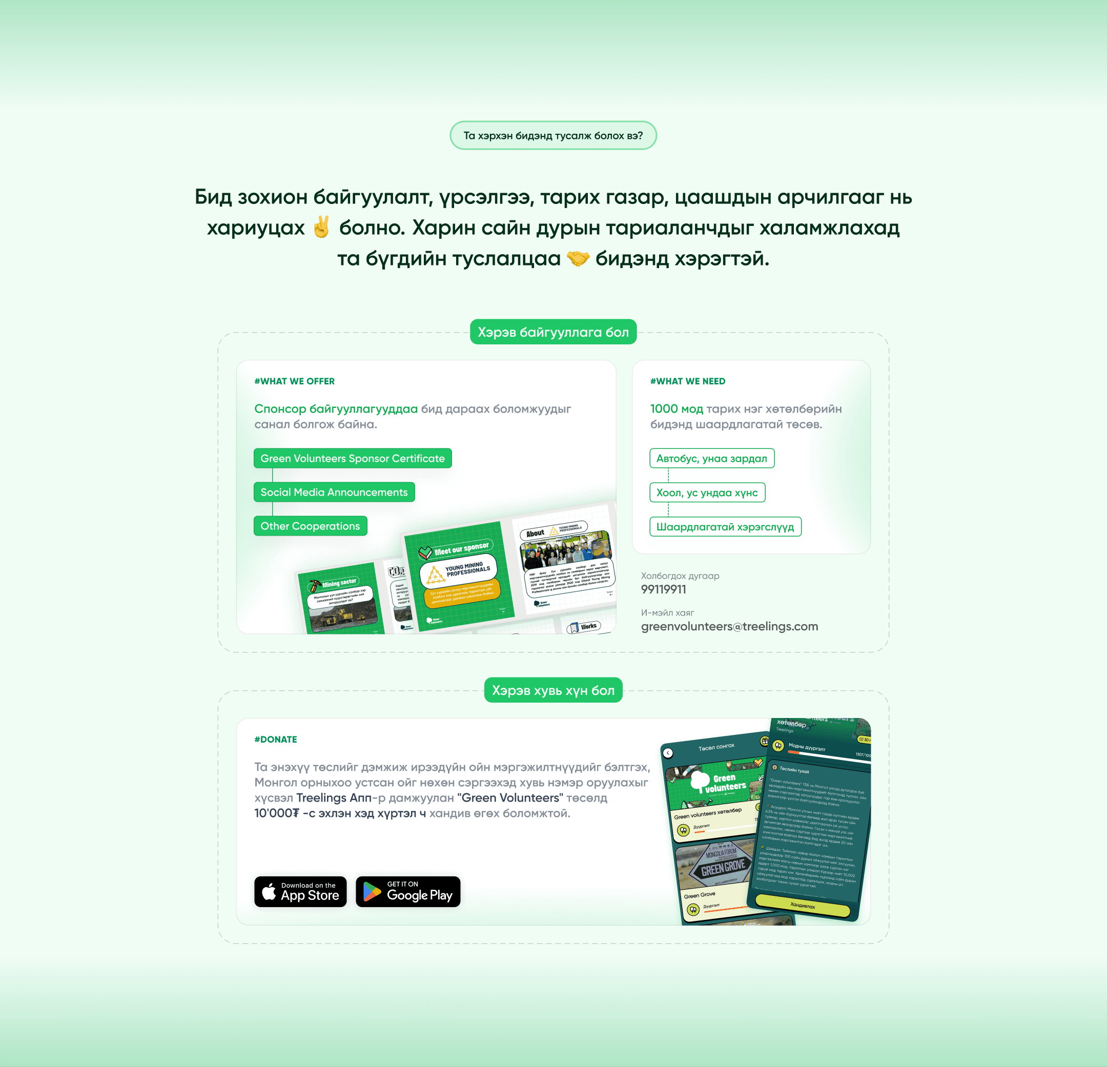
Split the page rather than blend it. Below the gallery, the page forks: one path for organisations, one for individuals. Sponsors get what's offered (certificate, social acknowledgement, further partnership) against what's needed (transport, food and water, tools) — the actual cost of a 1,000-tree programme, stated plainly. Individuals route into the Treelings app from ₮10,000. Each audience gets a complete argument without wading through the other's.
Four seasons of proof, filterable. The gallery organises by season — 2024, 2025, spring, autumn — so a volunteer or sponsor sees four real cycles of planting days instead of stock photography. On a programme where the whole pitch is "this actually happens," the archive is the argument.
A token system underneath. The page runs on an 11-step primary ramp with alpha variants, a parallel slate scale, and semantic neutrals. More structure than a single page needs — which was the point. It was specced as a system the dev team could implement and Treelings could extend, not as a one-off page style.


Outcome
Live on the Treelings site and running. Four seasons since launch — autumn 2024, spring 2025, autumn 2025, spring 2026 — and 1,000+ volunteers through the programme, with 1,000 trees planted per event.
Built by Mezorn's development team from my spec, without me on the implementation.
What I Learned
Splitting the page was cheaper than balancing it. I spent the first pass trying to write copy that worked for both volunteers and sponsors, and it persuaded neither. Two clear paths took less effort and worked better.
The concrete beat the emotional. The schedule card — bus times, meal times, when you get home — does more recruiting than any appeal to caring about forests. People don't hesitate because they're unconvinced; they hesitate because they don't know what they're agreeing to.
Designing something I wasn't building changed how I worked. Specifying a token system instead of styling a page meant the dev team could implement it without asking me questions, and Treelings could extend it after I'd moved on.
Cyrillic isn't Latin with different characters. Line lengths, weight balance, and the way highlighted text sits in a paragraph all behave differently, and designing to Latin metrics first would have meant rebuilding the type scale.
Back
Green Volunteers — Reforestation NGO, Treelings
One page, two audiences — volunteers and sponsors, each with a complete argument. Cyrillic typography, specced for the dev team to build.
Role
Design & Copy
Industry
Environment · Nonprofit
status
Live
Year
2025
Challenge
Green Volunteers takes young people out of Ulaanbaatar for planting days, teaches ecological practice alongside the work, and puts 1,000 trees in the ground each event. Four seasons in, 1,000+ volunteers have been through it, co-organised with the Mongolian Forest Research Association.
The page had to do two incompatible jobs. A prospective volunteer wants to know what the day is actually like — where to meet, what they'll do, whether they'll be out of their depth. A sponsor wants the case for funding — the scale of the problem, what a programme costs, what they get back. Most NGO pages pick one and lose the other, or blend both into something that persuades neither.
Two more constraints. The whole thing is in Mongolian, so the typography had to be built around Cyrillic text metrics rather than a Latin layout with translation dropped in. And I wasn't building it — the page had to be specced cleanly enough for Mezorn's dev team to implement without me.
Process
Evidence before sentiment. The problem section leads with numbers set as highlighted pills inside running Mongolian text: only 7% of the country forested, 77% affected by desertification, 20 forestry specialists trained per year. Pulling the figures out as inline highlights rather than a stats band keeps them inside the sentence that gives them meaning. The last one reframes the whole programme — it isn't only about trees, it's a pipeline for expertise a country of three million doesn't have.
Answer the question that actually stops people. The thing keeping someone from volunteering isn't whether they care, it's not knowing what they're signing up for. So one card in the bento is an hour-by-hour schedule — bus leaves the city at 9:00, breakfast on site at 10:30, planting at 12:00, dinner at 16:00, back to Ulaanbaatar at 17:00. It answers the uncertainty literally, in sequence.
Split the page rather than blend it. Below the gallery, the page forks: one path for organisations, one for individuals. Sponsors get what's offered (certificate, social acknowledgement, further partnership) against what's needed (transport, food and water, tools) — the actual cost of a 1,000-tree programme, stated plainly. Individuals route into the Treelings app from ₮10,000. Each audience gets a complete argument without wading through the other's.
Four seasons of proof, filterable. The gallery organises by season — 2024, 2025, spring, autumn — so a volunteer or sponsor sees four real cycles of planting days instead of stock photography. On a programme where the whole pitch is "this actually happens," the archive is the argument.
A token system underneath. The page runs on an 11-step primary ramp with alpha variants, a parallel slate scale, and semantic neutrals. More structure than a single page needs — which was the point. It was specced as a system the dev team could implement and Treelings could extend, not as a one-off page style.
Outcome
Live on the Treelings site and running. Four seasons since launch — autumn 2024, spring 2025, autumn 2025, spring 2026 — and 1,000+ volunteers through the programme, with 1,000 trees planted per event.
Built by Mezorn's development team from my spec, without me on the implementation.
What I Learned
Splitting the page was cheaper than balancing it. I spent the first pass trying to write copy that worked for both volunteers and sponsors, and it persuaded neither. Two clear paths took less effort and worked better.
The concrete beat the emotional. The schedule card — bus times, meal times, when you get home — does more recruiting than any appeal to caring about forests. People don't hesitate because they're unconvinced; they hesitate because they don't know what they're agreeing to.
Designing something I wasn't building changed how I worked. Specifying a token system instead of styling a page meant the dev team could implement it without asking me questions, and Treelings could extend it after I'd moved on.
Cyrillic isn't Latin with different characters. Line lengths, weight balance, and the way highlighted text sits in a paragraph all behave differently, and designing to Latin metrics first would have meant rebuilding the type scale.