Back
Back
Dulaanbaatar — National home-insulation movement
A savings calculator turns an air-pollution argument into a number a household can act on. Brand, site, and copy.
Role
Brand & Design
Industry
Civic · Environment
status
Live
Year
2025

Challenge
Ulaanbaatar's ger districts burn coal to survive winter, which makes the city one of the most polluted capitals in the world. Insulation attacks that at the source: an insulated home burns dramatically less fuel.
But insulation is an abstract, unglamorous, upfront cost with a benefit nobody can see. Telling someone it's good for the city moves no one — the cost lands on the household and the benefit lands on everybody. And there's a deadline: the argument has to be made before the cold arrives, not during it.
The name had to carry the idea before anyone read a word: dulaan (warm) + Ulaanbaatar. The city renamed for what it could be.

Process
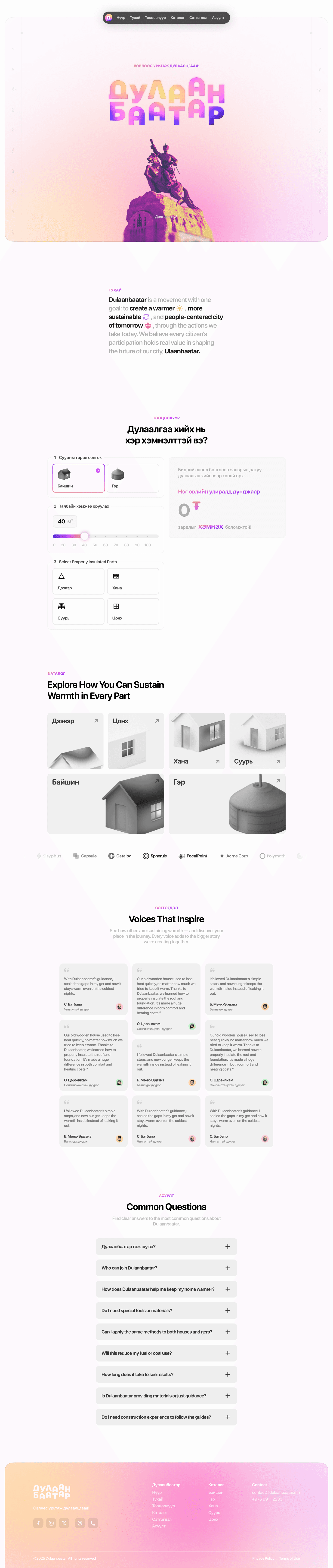
Make the invisible saving a number. The calculator is the centrepiece, not a feature. Three questions — house or ger, floor area on a slider, which parts are already insulated (roof, walls, floor, windows) — and it returns what this household would save over one winter, in tögrög. It converts a civic argument into a personal one, and it takes about fifteen seconds.
Organise the catalog by building part, not by product. Roof, windows, walls, floor, house, ger. Someone arrives knowing what's cold, not knowing what to buy — so the entry point is the part of their home, and the method follows. A general guide would have been easier to build and much easier to bounce off.
Let the neighbours do the persuading. The testimonials are the strongest content on the site and they run long deliberately — most sites would cut them to a pull-quote. These are households by district, and they're specific in a way no campaign copy could be: two sacks of coal a day down to one, rooms holding 20–28°C, ₮250–300k saved a year, two to three hours a day no longer spent tending a fire, children not getting sick this winter, one family buying a grill with what they saved. One woman describes learning at a training session, insulating her door that evening, then her floor with cardboard two days later, then working through the guide part by part — and her neighbour's testimonial follows, describing her coming over to teach them. That's the mechanism the whole campaign depends on, documented in the testimonials themselves.
A warm palette for a cold problem. Gradients running pink through violet and amber, against a subject that's about coal smoke and winter. The identity deliberately doesn't look like environmental campaigning — no green, no grey, no smog photography. It looks like the outcome rather than the problem.
Three breakpoints, componentised. The Figma file runs Wider Desktop (1960px), Desktop, and Mobile as parallel layouts, with navigation, hero, calculator, catalog, FAQ, and footer built as components against a defined palette. It was specced to be built in Next.js by a dev team, not styled page by page.

Outcome
Live at dulaanbaatar.city, built by the development team from my design. The testimonials on it come from households already through the Дулаан шийдэл programme, in Ulaanbaatar and five other provinces.

What I Learned
The calculator did what the copy couldn't. I could write about air quality for a page and move nobody; three inputs and a number in tögrög does it in fifteen seconds. When the benefit is invisible, make the arithmetic visible.
Long testimonials beat short ones here. Every instinct says trim them, but the specificity is the persuasion — "two sacks down to one" and "20 to 28°C" are unfalsifiable in a way that "warmer home" isn't. I left them at full length and it's the best decision on the page.
Not looking like a climate campaign was a choice. Green and grey signal an issue people already feel guilty about and tune out. A warm gradient palette shows the result instead of the problem, and it's what lets an unglamorous subject feel like something you'd want.
Back
Dulaanbaatar — National home-insulation movement
A savings calculator turns an air-pollution argument into a number a household can act on. Brand, site, and copy.
Role
Brand & Design
Industry
Civic · Environment
status
Live
Year
2025
Challenge
Ulaanbaatar's ger districts burn coal to survive winter, which makes the city one of the most polluted capitals in the world. Insulation attacks that at the source: an insulated home burns dramatically less fuel.
But insulation is an abstract, unglamorous, upfront cost with a benefit nobody can see. Telling someone it's good for the city moves no one — the cost lands on the household and the benefit lands on everybody. And there's a deadline: the argument has to be made before the cold arrives, not during it.
The name had to carry the idea before anyone read a word: dulaan (warm) + Ulaanbaatar. The city renamed for what it could be.
Process
Make the invisible saving a number. The calculator is the centrepiece, not a feature. Three questions — house or ger, floor area on a slider, which parts are already insulated (roof, walls, floor, windows) — and it returns what this household would save over one winter, in tögrög. It converts a civic argument into a personal one, and it takes about fifteen seconds.
Organise the catalog by building part, not by product. Roof, windows, walls, floor, house, ger. Someone arrives knowing what's cold, not knowing what to buy — so the entry point is the part of their home, and the method follows. A general guide would have been easier to build and much easier to bounce off.
Let the neighbours do the persuading. The testimonials are the strongest content on the site and they run long deliberately — most sites would cut them to a pull-quote. These are households by district, and they're specific in a way no campaign copy could be: two sacks of coal a day down to one, rooms holding 20–28°C, ₮250–300k saved a year, two to three hours a day no longer spent tending a fire, children not getting sick this winter, one family buying a grill with what they saved. One woman describes learning at a training session, insulating her door that evening, then her floor with cardboard two days later, then working through the guide part by part — and her neighbour's testimonial follows, describing her coming over to teach them. That's the mechanism the whole campaign depends on, documented in the testimonials themselves.
A warm palette for a cold problem. Gradients running pink through violet and amber, against a subject that's about coal smoke and winter. The identity deliberately doesn't look like environmental campaigning — no green, no grey, no smog photography. It looks like the outcome rather than the problem.
Three breakpoints, componentised. The Figma file runs Wider Desktop (1960px), Desktop, and Mobile as parallel layouts, with navigation, hero, calculator, catalog, FAQ, and footer built as components against a defined palette. It was specced to be built in Next.js by a dev team, not styled page by page.
Outcome
Live at dulaanbaatar.city, built by the development team from my design. The testimonials on it come from households already through the Дулаан шийдэл programme, in Ulaanbaatar and five other provinces.
What I Learned
The calculator did what the copy couldn't. I could write about air quality for a page and move nobody; three inputs and a number in tögrög does it in fifteen seconds. When the benefit is invisible, make the arithmetic visible.
Long testimonials beat short ones here. Every instinct says trim them, but the specificity is the persuasion — "two sacks down to one" and "20 to 28°C" are unfalsifiable in a way that "warmer home" isn't. I left them at full length and it's the best decision on the page.
Not looking like a climate campaign was a choice. Green and grey signal an issue people already feel guilty about and tune out. A warm gradient palette shows the result instead of the problem, and it's what lets an unglamorous subject feel like something you'd want.