Back
Back
UBCab & Grid
Building the design system and shipping core features for Mongolia's largest ride-hailing platform — 1.4M+ users.
Role
Product Designer
Industry
Mobility · Lifestyle
status
Live
Year
2025
Challenge
Part 1 — Grid Design System
Building the Design Infrastructure That Makes Everything Else Possible
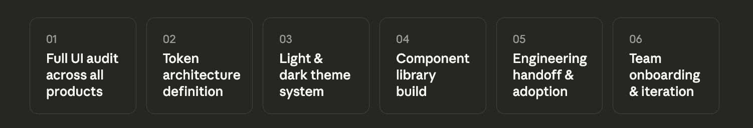
When I joined Mezorn as Product Designer, the UBCab ecosystem had a foundational problem that no individual feature could fix: there was no shared design language. UBCab, UBEats, and UBExpress had grown independently, accumulating visual inconsistencies, duplicated components, and divergent patterns. Designers were rebuilding the same buttons and cards from scratch on every project. Engineers were implementing UI differently across platforms. Light and dark theme support was broken. Onboarding a new designer meant weeks of reverse-engineering undocumented decisions.
The root cause wasn't bad design — it was the absence of infrastructure. Before shipping any new feature, I needed to build the foundation that would make every future feature faster, more consistent, and easier to maintain.

Process
Token Architecture Before Components
Most designers start a design system by building components. I started with tokens — the semantic layer of color, typography, spacing, and radius that components are built from. This decision was deliberate: tokens are what make light/dark theme switching work without duplicating every component. By defining the token architecture first, I ensured Grid could support theme changes at the system level rather than requiring manual overrides on every individual component. This became the foundation that made the entire system scalable.
Building Grid to Serve Real Product Needs, Not Theoretical Completeness
A common design system failure mode is building a perfect, comprehensive library that nobody uses because it doesn't map to real product needs. I took the opposite approach — I built Grid iteratively alongside actual feature work. Every component I added was immediately stress-tested in a real product context. This meant Grid launched with fewer components but 100% adoption, rather than a complete library that sat unused.
Engineering Partnership From Day One
Design systems only have value when they're implemented in code. I involved engineering from the beginning — not just handing off a Figma library, but working with engineers to ensure Grid's token naming conventions mapped directly to implementation. This alignment meant design and code stayed in sync as the system evolved, and prevented the common problem where a design system looks perfect in Figma but fragments in production.

Outcome
Grid is now the single source of truth for UI across UBCab, UBEats, UBExpress, and 3+ additional Mezorn products — 6+ platforms total. New features ship faster. New designers onboard in days, not weeks.
What This Role Taught Me
Leading design at a platform with 1.4M+ users taught me that the highest-leverage design work isn't always the most visible. Building Grid — invisible infrastructure that no user ever sees — had more impact on product quality than any individual feature. The designers who build systems enable the work of everyone who comes after them. That realization changed how I think about seniority in design: the most senior contribution is often the one that makes everyone else's work faster, more consistent, and more confident.

Back
UBCab & Grid
Building the design system and shipping core features for Mongolia's largest ride-hailing platform — 1.4M+ users.
Role
Product Designer
Industry
Mobility · Lifestyle
status
Live
Year
2025
Challenge
Part 1 — Grid Design System
Building the Design Infrastructure That Makes Everything Else Possible
When I joined Mezorn as Product Designer, the UBCab ecosystem had a foundational problem that no individual feature could fix: there was no shared design language. UBCab, UBEats, and UBExpress had grown independently, accumulating visual inconsistencies, duplicated components, and divergent patterns. Designers were rebuilding the same buttons and cards from scratch on every project. Engineers were implementing UI differently across platforms. Light and dark theme support was broken. Onboarding a new designer meant weeks of reverse-engineering undocumented decisions.
The root cause wasn't bad design — it was the absence of infrastructure. Before shipping any new feature, I needed to build the foundation that would make every future feature faster, more consistent, and easier to maintain.
Process
Token Architecture Before Components
Most designers start a design system by building components. I started with tokens — the semantic layer of color, typography, spacing, and radius that components are built from. This decision was deliberate: tokens are what make light/dark theme switching work without duplicating every component. By defining the token architecture first, I ensured Grid could support theme changes at the system level rather than requiring manual overrides on every individual component. This became the foundation that made the entire system scalable.
Building Grid to Serve Real Product Needs, Not Theoretical Completeness
A common design system failure mode is building a perfect, comprehensive library that nobody uses because it doesn't map to real product needs. I took the opposite approach — I built Grid iteratively alongside actual feature work. Every component I added was immediately stress-tested in a real product context. This meant Grid launched with fewer components but 100% adoption, rather than a complete library that sat unused.
Engineering Partnership From Day One
Design systems only have value when they're implemented in code. I involved engineering from the beginning — not just handing off a Figma library, but working with engineers to ensure Grid's token naming conventions mapped directly to implementation. This alignment meant design and code stayed in sync as the system evolved, and prevented the common problem where a design system looks perfect in Figma but fragments in production.
Outcome
Grid is now the single source of truth for UI across UBCab, UBEats, UBExpress, and 3+ additional Mezorn products — 6+ platforms total. New features ship faster. New designers onboard in days, not weeks.
What This Role Taught Me
Leading design at a platform with 1.4M+ users taught me that the highest-leverage design work isn't always the most visible. Building Grid — invisible infrastructure that no user ever sees — had more impact on product quality than any individual feature. The designers who build systems enable the work of everyone who comes after them. That realization changed how I think about seniority in design: the most senior contribution is often the one that makes everyone else's work faster, more consistent, and more confident.